Transitioning from fintech to bank.

25 October 2023 | by Kroo Marketing Team
This blog post was accurate when we published it - visit kroo.com or your Kroo app for the most up to date information
In June 2022, we were granted our UK banking licence. With that, we began the long journey to reimagine the app, transitioning from our origins as a fintech to becoming a fully licensed bank.
Beauty and functionality: The intersection of art and banking.
The brand redesign was inspired by a powerful vision: the seamless integration of art and banking.
This idea developed into the “installation concept” that envisions the product as a form of art on a pristine canvas where products are designed with utility in mind while also being a joy to use.
Good design considers these two elements equally, turning an intuitive user interface into a captivating experience for our users.
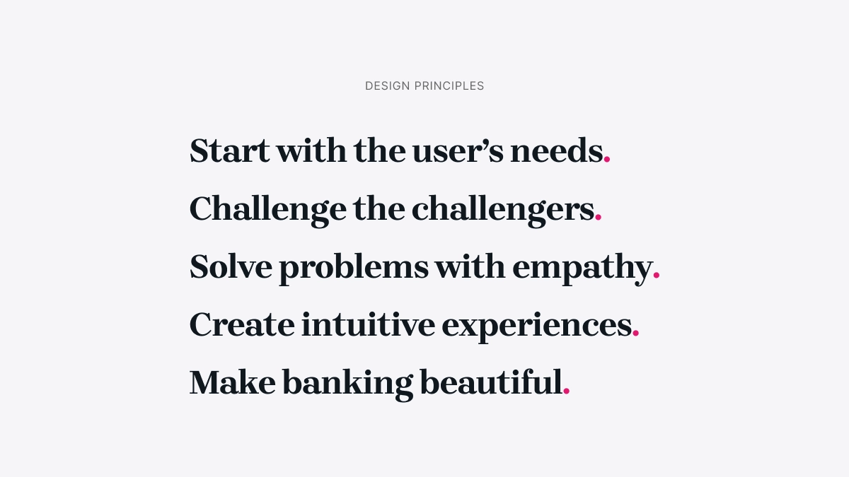
Design principles: A foundation for simplicity and future growth.
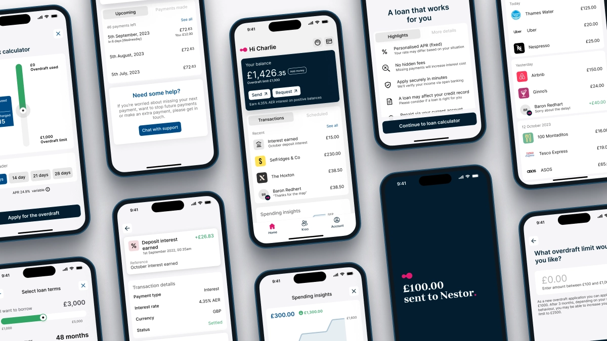
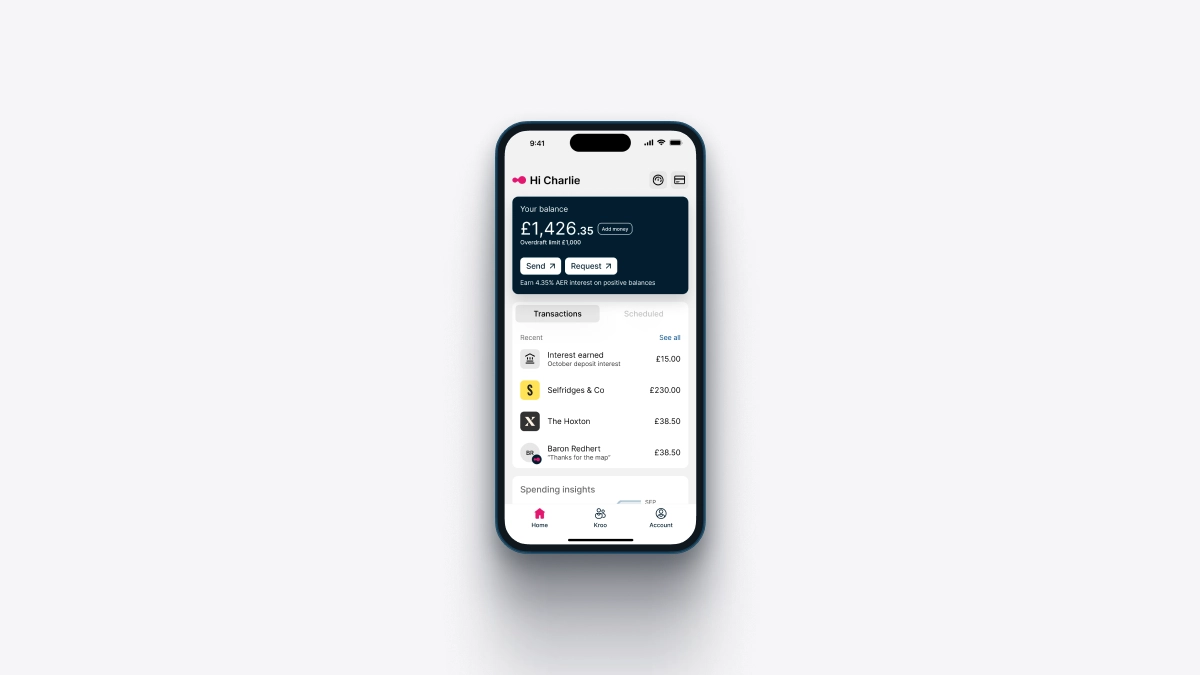
While functional, the previous app had grown cluttered with disproportionate concepts and colours. The new brand design starts with users’ needs in mind, distils the colour palette and champions a clean, intuitive interface.
This more considered approach is a solid foundation for our more focused product strategy. It offers a flexible platform that seamlessly integrates new features as the financial landscape evolves.
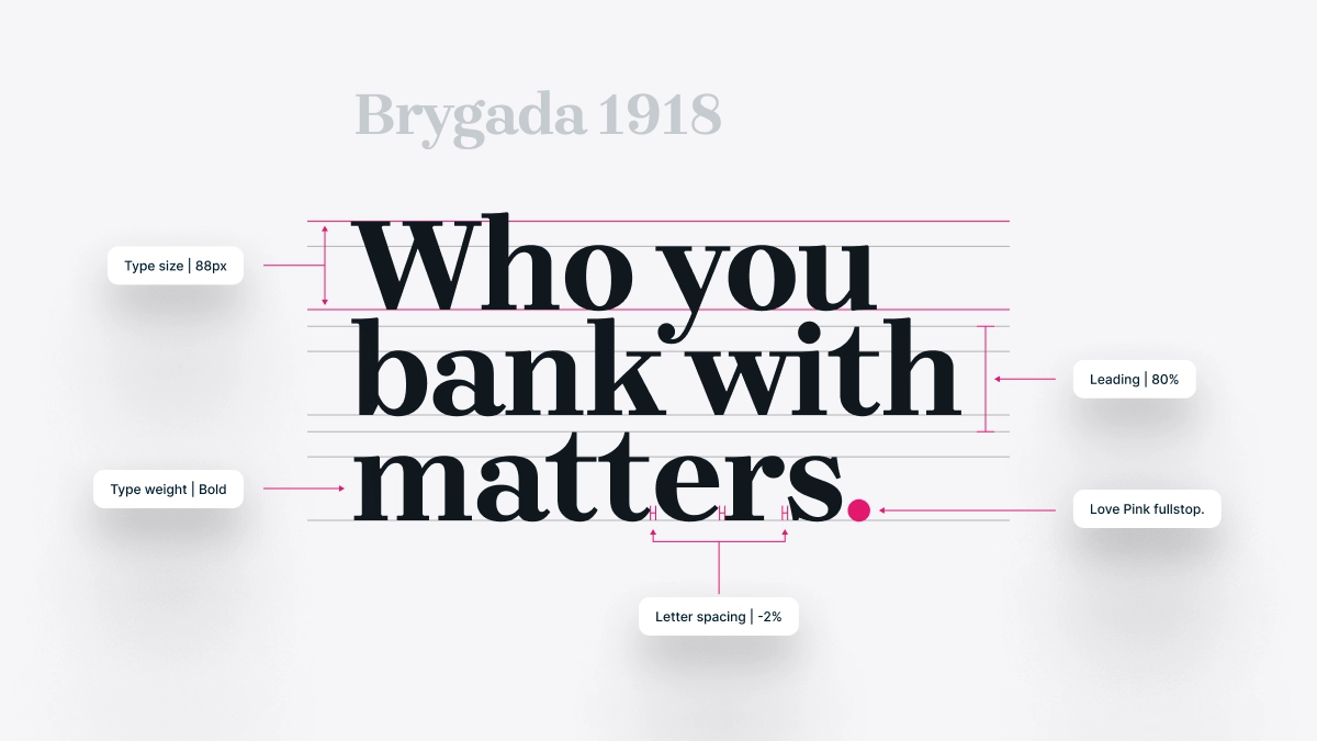
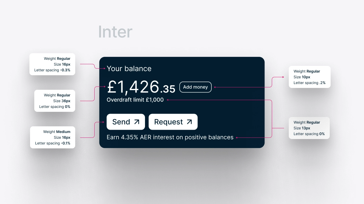
Typography: A typeface tailored for digital.
The brand redesign included a rethink of our typography. The previous font was designed primarily for printed materials and did not offer the versatility to support digital screens. The new sans-serif font, Inter, prioritises readability on small digital devices and large outdoor billboards, ensuring a consistent and pleasing user experience across various platforms.
The new brand typographical strategy complements Inter with Brygada 1918, an oversized serif font that adds an elegant touch to headlines.
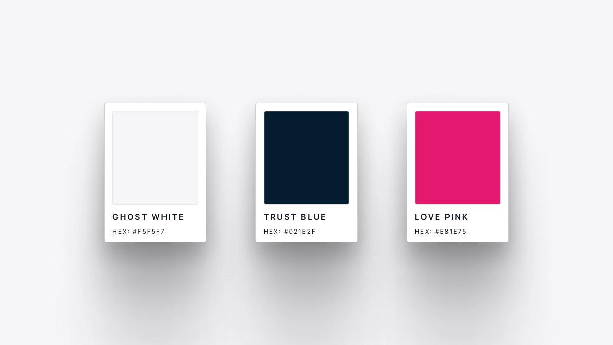
Colours: A thoughtful and accessible palette.
The new brand adopts a colour palette that enhances visual appeal while ensuring omnichannel accessibility to all users. A “Ghost White” canvas provides a subtle backdrop to our new two primary brand colours: “Trust Blue” and the “Love Pink”.
Trust Blue embodies our integrity and solidity as a bank, while Love Pink features on our logotype signify moments of true joy and importance.
When you see these colours combined, you know you're in safe hands.
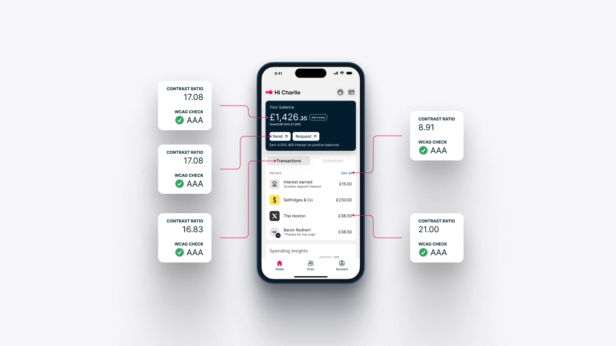
Accessibility: A pledge to inclusivity.
Accessibility was a foundational pillar of our brand redesign process, especially when we reimagined our mobile product. The old app presented accessibility issues to our users, which have all been addressed in our redesign.
The revamped Kroo app passes the AAA accessibility rating, ensuring a more inclusive and user-friendly experience. Working with developers, we've also improved the usability of screen readers.
App icon: A symbol of our new identity.
As the face of our digital banking experience, the app icon underwent its own transformation, reflecting our new identity. The icon now embodies the minimalist and considered approach to design and colour relationship, inviting users to explore.
![]()
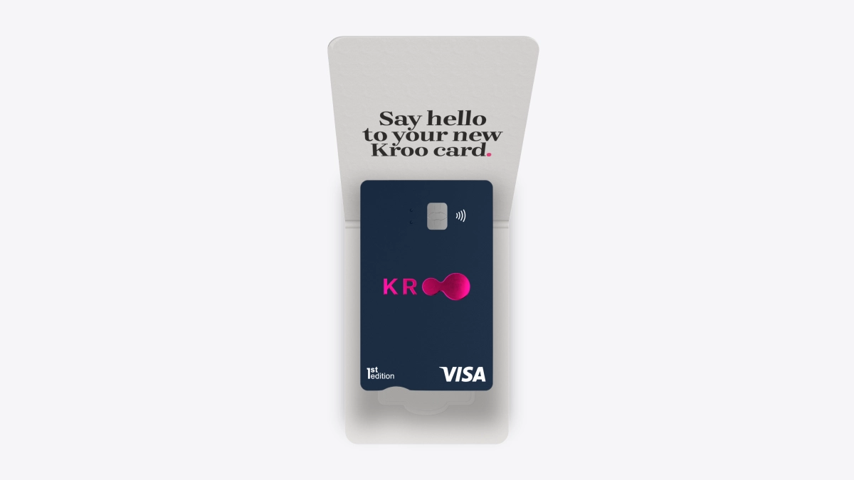
Debit card and card carrier design: Blending beauty and functionality.
Our commitment to design also extends to the physical world. Beyond the digital experience on the app, we’ve reimagined our debit card and card carrier packaging.
The new card carrier design harmonises form and function, presenting the new debit card as an object of desire.
Future evolution: Prepared for tomorrow.
Our design journey is in continuous evolution. We've built a reimagined digital experience with a keen eye on the future. The minimalist, scalable design of our website and mobile products enables us to integrate new features and technologies effortlessly, ensuring that the needs of our users remain at the forefront of banking innovation.
Our latest brand redesign effort is more than just a fresh coat of paint; it's a transformation that mirrors our evolution from fintech to a fully licensed bank, with a focus on simplicity, accessibility, and future readiness.
We're committed to providing our users with a banking experience that is as beautiful as it is functional, and we invite you to explore the new, reimagined world of Kroo with us.
Who you bank with matters.